- Introduction (Intro)
- Before you start (Setup)
- Options for plugin (Options)
- Settings for Tips and Pops (Settings)
- CSS to style the tips and pops (Styles)
- Under the hood (Techie)
xbTip-Pop Button is an editors-xtd plugin for easily inserting bootstrap toolpip or popover code into articles or other content.
The main plugin page is here https://crosborne.uk/tippop
You can also find it and download it from jed https://extensions.joomla.org where you could leave a review if you find a problem with it to warn others before they download it. This is not a professional development - I developed it for my own use and I can't promise to fix it to work with setups that don't match my own, but I will generally try.
If you do find a problem please do let me know using the comment form on this page or the main page or simply by emailing me: This email address is being protected from spambots. You need JavaScript enabled to view it.
Before enabling the button you need to make sure that:
- Your template is loading bootstrap
- Your template includes appropriate triggers for tooltip and popover actions
Generally with Joomla 3.9 bootstrap will be loaded, but should nothing work you might like to check the template index.php file and if necessary insert a line similar to this fairly near the top of the file (in the current Protostar template it appears at line 39 just before the template.js file is loaded).
JHtml::_('bootstrap.framework');For example in the Protostar template you will find the following around line 38
// Add JavaScript Frameworks
JHtml::_('bootstrap.framework');
JHtml::_('script', 'template.js', array('version' => 'auto', 'relative' => true));
This is telling you that the template is loading Bootstrap and then loading it's template.js file.
As of TipPop v1.2 a javascript file is provided which you can simply include by adding one line in the template index.php file
Immediately after the line which adds the script for the template.js file shown above insert the following line:
JHtml::_('script', 'media/plg_button_xbtipbtn/js/tippop.js', array('version' => 'auto', 'relative' => false));The provided file uses the class names .xbtip and .xbpop as the selectors to trigger a tooltip or popover. These are set as the defaults in the plugin options page. If you need to change them then edit the tippop.js file (see Techie section below) and change the names to your new names on the options page.
You probably also want to include some styling, both for the appearance of the Tips and Pops themselves, and also for the text that triggers them. The quick way to do this is to simply add the sample stylesheet to your template by adding the following line into the template index.php file right after the lines that load the other stylesheets.
JHtml::_('stylesheet', 'media/plg_button_xbtipbtn/css/tippop.css', array('version' => 'auto', 'relative' => false));There is more detail on the use of CSS to change the appearance in the Styles section below. This is an example of a tooltip using the styles from tippop.css and here is a popover. You can of course either modify the file yourself in the media/plg_button_xbtipbtn/css/ folder, or copy the classes you want to use into your own template stylesheet.
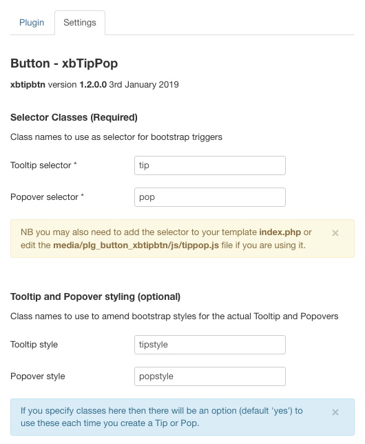
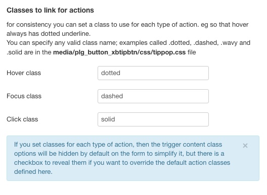
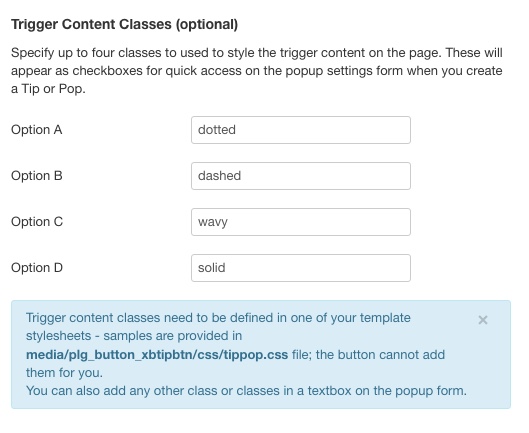
 The following parameter options can be defined to set defaults for your TipPops. There are four sections.
- Class names to use to select the elements for Tips & Pops (*required) -default xbtip and xbpop
- Classes to use for the Tips and Pops themselves, overriding the Bootstrap default look to match your site.
- Classes to link to the type of event (hover, click or focus) (eg to dotted underline all hovers and dashed underline all focuses)
- Up to four quick-access class names to apply to the TipPop which can be simply selected in the settings
The first section defines the class names used by bootstrap to trigger the tip or pop. This is required and needs to match the names in your initialisation script (eg media/plg_button_xbtipbtn/js/tippop.js).
The second section lets you define a class to use to style the tooltip and popover styles, overriding the bootstrap defaults. See section below on Styles for details.
You could simply add style definitions to the tip and pop trigger classes to style the trigger text and the tips & pops. I prefer to have a separate class so that I can make it do something different as required. eg in some areas of a site you might which to use a different styling for tooltips, or make the visual cue match the required action (hover/focus/click) rather than the result (tooltip or popover).
 Personally I think it is a good idea to be consistent and have all hovers appear with the same cue, and a slightly different cue for click or focus actions. This is where the third section comes in. You can define here a default class for each type of action. You can override these in the popup dialogue on a per occasion basis should you wish to break your own rules.
 The final section of the options lets you enter four class names for quick selection in the popup dialogue.
When inserting a TipPop the following options are available
- Tooltip or Popover (default Tooltip)
- Underline style (none, dotted, dashed, wavy, solid)
- default none, these only appear if classes are defined in parameter options. Not applicable to img enclosing element
- Placement (top, right, bottom, left)
- default right. NB auto placement doesn't currently work correctly in Joomla
- Trigger type (hover, click, focus)
- default hover. See documentation page for notes on usage, especially focus.
- Tooltip text or Popover title (text input)
- Popover body text (textarea input)
- Only appears if Popover selected as type
- Type of enclosing element (span, a, img, other)
- default span
- href for a or src for img (text input)
- appear if a or img is selected. No href for focus trigger
- Classes in addition to selector and primary style
- includes option to use (default) primary styles if defined in parameter options
- Content (text input)
- default 'xxx' as placeholder. Not applicable where the content is an image tag or where there is text selected in the editor.
If text is selected in the editor and the enclosing element type is span then the span will be wrapped around the selected text so that the selected text is used as the content. NB this might cause problems if the selected text includes other elements. In addition if the xbElement Content plugin is installed and available then there is an option to used {xb_ ... } wrapper so that the detail is visiible in the editor without switching to code view.
CSS to style the tips and pops
There are two type of style you might want to add to your template although you can just stick with the defaults or use other existing classes.
Firstly you might like to provide a style to give your readers a clue that there is a tooltip or popover present for some text. In the old days all links were simply blue and underlined . Modern websites have moved away from this very simple scheme and have tended to do away with underlines for <a > links, prefering simply a slightly contrasting text format as being less intrusive on the reading flow.
By default if you use <span > to wrap your tips and pops there will be no visual clue at all that they are there. Personally I like to use dotted or dashed underlines - with dotted underlines cueing a hover tip or pop and dashed underlines for a focus tip or pop. I don't normally use the click trigger for a tip or pop as the user has to click again on the same place to clear it and this can be confusing when they are used to modal popups that clear if you simply click anywhere else. If I did use them I would use a solid underline like an old school link.
So here are the styles I use for the various underlines. You might prefer to use different cues, simply adjust the styles accordingly. Then in the plugin options I specify the default for hover as dotted, for click as solid and for focus as dashed.
As well as defining the four underline types I also make the underline colour match the site style.
/* Underlines for user cue */
.solid, .solid:hover,
.dashed, .dashed:hover,
.dotted, .dotted:hover,
.wavy, .wavy:hover {
	text-decoration-line: underline;
	text-decoration-color: #820000;
}
.solid, .solid:hover {
	text-decoration-style: solid;
}
.dashed, .dashed:hover {
	text-decoration-style: dashed;
}
.dotted, .dotted:hover {
	text-decoration-style: dotted;
}
.wavy, .wavy:hover {
	text-decoration-style: wavy;
}
I also use one of these styles as the default for hover, focus and click actions in the TipPop plugin options so that all my focus tips and pops have the same visual cue.
Moving on to styling the actual tooltips and popovers there are a couple of gotchas to be aware of. The first is that your stylesheet is probably going to be loaded and read before the bootstrap one so anything that conflicts with what is in the bootstrap style will need to be flagged !important
The next is that if you are using focus triggers then bootstrap will impose an outline style on the text that is focussed - to my mind the default is very ugly (a thick blurred blue border) so you certainly want to add a :focus outline style to your default styles for tips and pops.
In this example I am using tipstyle and popstyle as the class names to override the default bootstrap styles for what appears in the tip or pop.
/* Tooltip and Popover styles */

/* Outlines when focused */
.tipstyle:focus {
   outline-style: dotted !important;
   outline-width: 1px;
}
.popstyle:focus {
   outline-style: dashed !important;
   outline-width: 1px;
}
/* Popover styles */
 .popstyle + .popover {
    border: 2px solid #820000;
}
/* Popover Header */
.popstyle + .popover > .popover-title {
    background-color: #FFFFE0 !important; /* #73AD21; */
    border-bottom: 1px solid #820000;
    color: #820000;
    font-size: 1.1em;
    font-weight:bold;
    text-align:center;
}
/* Popover Body */
.popstyle  + .popover > .popover-content {
    background-color: #FFFFF0 !important;
    color: #820000;
    padding: 10px 16px;
}
/* Popover Arrows */
.popstyle + .popover.right>.arrow:after {
    border-right-color: #820000;
}
.popstyle + .popover.left>.arrow:after {
    border-left-color: #820000;
}
.popstyle + .popover.bottom>.arrow:after {
    border-bottom-color: #820000;
}
.popstyle + .popover.top>.arrow:after {
    border-top-color: #820000;
}
/* Tooltip style */
.tipstyle + .tooltip > .tooltip-inner {
    background-color: #FFFFF0;
    color: #820000;
    border: 1px solid #820000;
    padding: 4px;
    font-size: 1em;
}
/* get rid of the slightly transparent default on bootstrap tooltip */
.tooltip.in {
	opacity: 1.0 !important;
	filter:alpha(opacity=100) !important;
}
/* Tooltip arrows */
.tipstyle + .tooltip.top > .tooltip-arrow {
    border-top-color: #820000;
}
 .tipstyle + .tooltip.bottom > .tooltip-arrow {
    border-bottom-color: #820000;
}
 .tipstyle + .tooltip.left > .tooltip-arrow {
    border-left-color: #820000;
}
 .tipstyle + .tooltip.right > .tooltip-arrow {
    border-right-color: #820000;
}
For Popovers we define the overall border style and the four arrow colours and then separate styles for the header (title) and the body (content) sections of the popover.
For tooltips there is only one style, but the colours for the arrows have to be defined separately.
The final gotcha is that bootstrap uses a partial transparency for tooltips, which can make them hard to read if you stray from the default black background with white text so you need to add the .tooltip.in style with an opacity of 1 and !important : opacity:1.0 !important;
Some techie stuff if you want to know how it works.
Essentially there are three files involved.
First is the main plugin file xbtipbtn.php (in the plugins/plg_button_xbtipbtn/ folder)
This creates the button and hooks it in to the editor. It also reads the options and langauge file and updates the template html file used for the popup window containing the settings when the button is pressed.
Secondly xbtipbtn_popup.xy-AB.html displays the popup (in the media/plg_button_xbtipbtn/html folder)
xy-AB is your langauge code. Only en-GB langauge files are provided in this version, use these to make your own translation if required. xbtipbtn_popup.en-GB.html is regenerated every time the editor is loaded in order to pickup any changes to the options or langauge. The source for this is xbtipbtn_tmpl.html.
Thirdly xbtipbtn.js is hooked in to run when the popup submit button is pressed (in the media/plg_button_xbtipbtn/js folder)
This reads all the settings from the form in the popup file and creates the necessary html to insert the tooltip or popup. This is inserted into the editor window at the current cursor position. If any text is selected in the editor then the tip or pop is wrapped around it.
In addition there is a stylesheet media/plg_button_xbtipbtn/css/xbtipbtn.css which is used by the popup template
Only en-GB is provided as a language file - if you want to translate for your own use make copies of en-GB.plg_editors-xtd_xbtipbtn.ini and ...sys.ini in the administrator/language folder with your own language code and edit them with your translations.
xbtipbtn.php
This has two main functions. Firstly it has to read the option settings and the language strings and create the popup form html file from the template, replacing the placeholder for options with appropriate values and then going through and replacing the language strings.
The option values required are taken either directly from the parameters, or in some cases calculated. The placeholders in the template file are in upper case and all start with "XB", eg "XBTIPSEL" which will get replaced with the name of the class set as the selector for tooltips in the parameters.
"XBACTCLASSOK" is an example of a value that gets calculated depending on which options are set. In this example if there are values for the three action classes (hover, click and focus) then XBACTCLASSOK is set to "inline" and the section of the form that displays the checkbox to use the predefined action class is displayed. If the action classes are not set, then the value is set to "none" and the checkbox is hidden.
So the text of the template file is loaded and all of the placeholders are replaced with appropriate values. A regex '!PLG_XBTIPBTN_([A-Z0-9_]+)!' is used to find the language strings and JText::_() is used to replace them with the appropriate strings from the language file.
The corrected text from the template file is then saved as the html for the popup form.
Once that is done the button is then created with its action being to open the popup form file just (re-)created in a modal window.
But before any of that we check that we are running on the administrator side, that we have the appropriate permissions, and that the selector classes have been defined in the options. If any of those tests fail then we don't display the button.
xbtipbtn_tmpl.html and xbtipbtn_popup.en-GB.html
As noted above xbtipbtn_popup.en-GB.html file is created from the template. Essentially it is a simple html form with various sections hidden or revealed according to paramter settings and choices made on the form. The 'submit' button is actually just a call to the javascript function in xbtipbtn.js which inserts the appropriate text into the editor.
There is some styling applied to the form from a stylesheet located in the media/css folder for the plugin. Some of the controls on the form call functions in the xbtipbtn.js file to hide or reveal other elements of the form.
xbtipbtn.js
This is where the bulk of the work is done. First up there are three functions that are used by the popup form
showElementsByClass() and hideElementsByClass() simply set the style="display:XYZ;" attribute of all elements with the given class to either 'none' or 'inline'. The show function can take a second parameter to specify 'block' instead of 'inline'
showHideElementsIfChecked() is used to either show or hide elements depending on the checked status of the given checkbox. It can be used to either show if checked or hide if checked depending on the second parameter.
The heavy lifting is done by the eventListener function which fires when the submit button is pressed.
This reads all the values from the form (a very long switch statement which could probably be rewritten in substantially shorter but less readable form), and creates the text that needs to be inserted into the editor.
The actual insertion is done by the insertTag() function. This detects if any text is highlighted (selected) in the editor form field and adjusts the actual text to be inserted accordingly. Since there is no generic getSelection function from Joomla for editors (tinyMCE has one, but JCE does not) we have to use jInsertEditorText() which will replace any selected text, so we have to detect the selection and save it by looking directly at the html in the editor content iframe.
If text is selected we wrap the tag around it, otherwise we use the text entered in the popup form. In case you forget to enter the text the default value of 'XXX' is inserted so you can simply edit it to the required value in the normal way.
If you found this descripton useful, or a help in developing your own plugin, please let me know - comment below or email.

