The xbArticleMan component v2.1 provides new back end views for the management of articles.
The component home page is Article Manager
The download page is here
Screenshots (click on image for a full-size popup):
Articles:Links
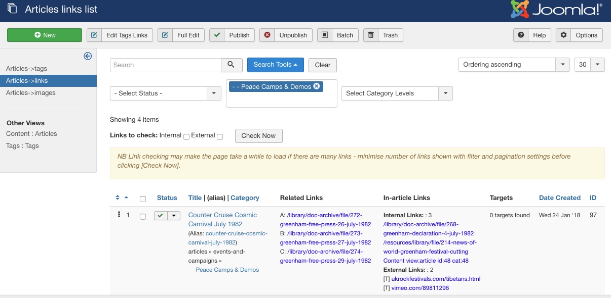
 Showing the Links view with the left hand sub-menu and the filter box.
The top menu includes two edit options for the first selected article - the simple edit within xbArtMan article view, and the full Content-Article editing screen.
The left sub-menu not only allows selection between the xbArtMan views but also includes links to the default Content-Articles and Tags-Tags component views.
The filter bar has the usual options for filter by status and category (including sub-category levels).
Beneath the filter bar is the options to check internal and external links. This is only shown when there are less than ten files shown as it can take quite a time if there are many links. Once checked the blue links turn green (ok) or red (broken). NB this is not 100% accurate as sometimes it is difficult to determine the correct link. Generally green links are definitely okay, red ones need further investigation.
The main list area has nine columns:
Ordering is slightly improved in that it now orders by category and then order so that if you have articles from more than one category in the list then each category is listed together to facilitate adjusting the ordering. In addition the order number is shown so you can see what is going on. (this should be how the drag and drop ordering should work throughout Joomla in my opinion)
The selection box works as normal as does the status column (the toggle featured option is not shown here to save space)
The next column has three bits of information - the article title, its alias, and the category. You can sort by either title or category by clicking in the column header. Clicking on the title goes to the simple xbArtMan edit view for that article. Clicking on the alias brings up a modal popup preview of the article - this uses the ?tmp=component parameter so just the article is shown with no surrounding context or styles. The category is shown with its full path through the hierarchy. Clicking on the category currently goes to the Category component edit view for that category - it might be more useful if it simply filtered the list by that category - what do you think?
The next column shows the article related links. The text displayed is a simplified version of the full link - mouseover for a tooltip giving the text that is actually displayed in the article info and the full link. If the link is set to open in a new tab/window then the link will be prefixed with [T]. Clicking the link will open a modal preview for internal links or the url in a new tab for external links.
The in-Article links column works in much the same way. Here the links are grouped together as to whether they are in-page destinations (#anchors in the same page), internal links to pages on this site, external links, or other links (eg mailto: ). The mouseover and click functions work as in the Related Links column.
The next column shows any in-page targets that are defined. The final two columns are the date and id for the article (the type of date is selected by the ordering drop-down as usual)
Articles:Tags
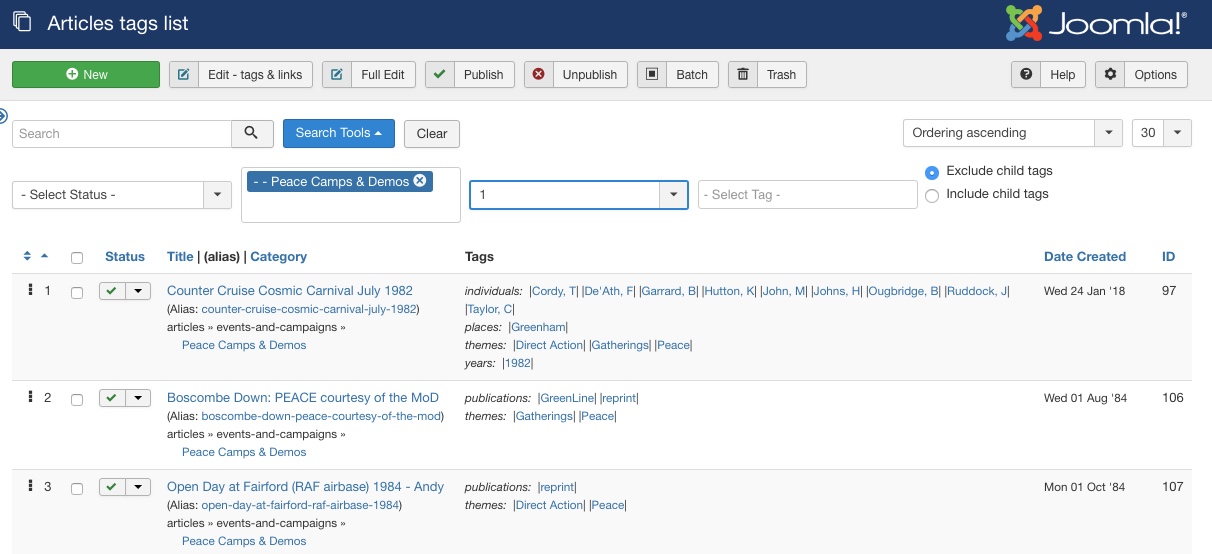
This view shows the left side sub menu collapsed - its content is the same as in the Articles:Links view.
The filter bar in this view includes the ability to filter by tag.
In the main area the first four and last two columns are the same as the Articles:Links view.
The fifth column shows the tags assigned to the article. These are sorted by their top level parent (analogous to a category for the tags beneath it).
Clicking on a tag switches to the Content:Articles view filtered by the selected tag to show all of the articles with that tag. As with clicking on the category might it be better to remain within this component?
The Articles:Images view is very much a work in progress so I am not showing a screenshot here yet. Basically it has the same columns as the Articles:Tags view but with in-article <img /> links listed instead of tags.
The final view is the simplified editing view. This is designed to allow the admin to quickly edit the related links and tags for an article if you spot something that needs changing.


